Thursday, January 13, 2011

Pedro Cabrita Reis Website

The Pedro Cabrita Reis website was my final school project (my PAA). I aimed to create a website which reflected an artist's work, and my interpretation of it, in its design and overall feel - a personal, but practical extension to the artist's cannon.
I tried to make a product with a streamline design, minimizing distractions from Pedro Cabrita Reis's art, and yet still utilise the essence, techniques, and features of his work to build the multimedia environment.

Home Page

Biography Page

Gallery Page

Interview Page

Contact Page


Flyer with Pedro Cabrita Reis current exhibitions


Digital Portfolio

The project goal was to develop a model of a functional Digital Portfolio for my school “Escola Secundária Artistica Antonio Arroio” with the students works from different courses.
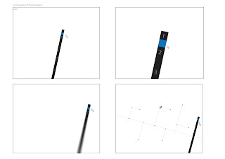
The idea for my project arose primarily from the stark, functional design of the Lisbon Subway map: lines, branches, nodes. 
If you want to see it working:  http://www.2shared.com/video/gbPRyY5L/AA_online.html


Another animation starts when we click on the course


The courses galleries are related to the subject, for example: Photography - Camera; Art - Pencil (...)  

"Texteis", Textiles 
"Fotografia", Photography  
"Desenho", Art
These are some of galleries with the works
When we click on the numbers, different works are showed 

"Desenho", Art Gallery
"Fotografia", Photography Gallery
"Texteis", Textiles Gallery
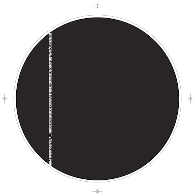
CD with my school logotype
CD
CD cover


                                   Folder to put the all the work

Fortunato Depero


Start Festival

     Logotype options
   
I used the mosquito for the image of this festival that I invented, because mosquitoes are usually associated with transmission. And this festival is all about transmission. Transmission of this new idea of a street festival, transmission of ideas, transmission of art concepts (...)


                                                Website Layout

Home page


Info- About Festival


Info- Competition 


Info- Lisbon


Gallery


Contact


By the book


Project Objectives: Develop a logotype for a new gathering space called by the book, which includes a cafeteria and bookshop

Target: People interested in the world around them. Whether or not linked to the arts and industries creative.

Barcode: This idea came when I was thinking about the word identity. From there I thought how else could a barcode represent this project: identifies with this new concept of combining a cafeteria with a bookshop where you can read while you're in a cafeteria. It also reminded me of the spine of books, music (a piano keyboard), and of course the very purpose of the bar code, the decoding information. It also integrates the idea of food consumption and purchase of books.

Why orange? Reflects the energy, creativity, good disposition and is usually associated with communication.
This color seemed more appropriate because it is catchy and memorable, is compatible with potential clients and represents well what the project aims.


Typographic Compositions


I searched and I selected phrases related with typography from different authors.
Then I did a Typographic Composition with each one of them.


I found two pictures in magazines of James Hetfield and wanted to create junction respecting the identity of the faces. I cut out each image and joined them


Then I filled it with patches of text.


Posters


Layout for the club "Lux Frágil"

I tried not to modify the existing aesthetics of Lux design drastically. I took as its starting point, a photograph taken by me of the space and created from it, a compositional space to integrate the information and visual information.
I related the type of music with psychedelic art, in order to create dynamic environment.


Promotional Posters for the "Fundação Calouste Gulbenkian"


I decided to make a promotional poster for the "Fundação Calouste Gulbenkian" because I work in the concert hall and would love to watch more contemporary music concerts.
I wanted to give a futuristic aesthetic by creating purposefully divergent lines that disrupts the composition. I wanted to combine the movement and visual dynamics, with this musical expression.

Drawings and Paintings